Mobile-Friendly Website Design
October 11th, 2011
This somewhat creepy animation of the Funhouse is here for a reason. Read on.
Now that you’ve finally settled on a website design that you really like, here’s a question for you. What does it look like on a mobile? And I don’t mean ‘is it pretty?’ If you’ve used any hand-held device to look at websites designed for desktop computers, you’ll know that it’s a frustrating experience.
Yes, you can zoom in to read any text but you’ll very likely need to do a lot of scrolling around the screen. As for the expensive brand video you had created, you can pretty much forget about that working. Most web video players are Flash-based and mobiles don’t support Flash. Even the html5 players have all kinds of quirks, meaning they might work on the iphone or a Blackberry, but not on Android. Then there’s the ipad to consider. Your Flash banner and other animation won’t work in a mobile or ipad.
So what’s the solution? Some sites have parallel mobile-specific versions running on a sub-domain, so for example you might see the equivalent of this type of url: mobile.funhousegraphics.com. That’s fine if you’re Twitter.com or something equally huge, but for the rest of us this has implications for Search Engine Optimisation. A sub-domain is a standalone website, therefore you would be splitting your web traffic between two different sites, an SEO faux pas.
This is where mobile-friendly website design comes in. The real answer is to dish up the exact same content from the same place using two different design templates. For example, I created the creepy web video of the Funhouse above and encoded a single version of it. But that single video will display differently depending on what device you run it on. Looking at a desktop monitor? It’ll fill most of this central column. Try scanning the image below to load this post in your smartphone:

On a mobile you’ll see a compact version specifically designed for hand-held devices. (That doesn’t explain why it’s creepy. I just felt like it. Halloween or something.)
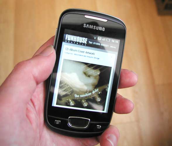
Likewise the image below, showing the compact version of funhousegraphics.com in an Android window, will itself be resized to fit a hand-held screen. So the mobile version of this site has all the video and functionality of the desktop version and serves up the very same creepy content, but with its own compact layout.
But hang on, don’t you need to build an app for people to download in order to dish up a proper mobile-friendly website? No, you don’t. Unless you want your mobile version to do something radically different from the desktop version (not just looking different, but having a different function) you won’t need to think about apps.
Mobile usage has been increasing dramatically and as the phones themselves get more sophisticated, people are expecting more from them. It’s up to web designers to find ways of delivering content to fill this need.
See my earlier post on html5 video, How Do I Make My Web Videos Html5 Compliant?

Categories: Mobile-Friendly Website Design | Tags: 3d animation, Mobile-Friendly Website Design, SEO, SEO consultant, Search Engine Optimisation, apps, hand-held device | No Comments


