May 23rd, 2013
Video player
How long has it taken me to update the site? This festive posting in May should give you an idea.
With the drive towards a greener future, traditional Christmas cards are taking a bit of a hit. Businesses are especially keen to show their environmentally-friendly credentials and turning to e-cards for greeting their customers.
But e-cards can be a bit flat and unengaging so we’re always on the lookout for novel ways of saying Merry Christmas. When a 3d advent calendar was suggested for Howden Engineering’s massive international customer-base, this seemed an ideal solution. A Christmas card with a difference.
Categories: 3d Animation, Miscellaneous Graphic Design |
Tags: 3d advent calendar, custom christmas cards | No Comments
December 1st, 2012
Video player
I get some unusual requests. ‘I want talking toast’ was a recent one. Last year I created a shivering house for the client, Direct Savings (see Direct Savings 3d Animation), and now it was decided the house should be inhabited by a family of toasties. You know, “you’ll be as warm as toast.” The last advert was a lot of fun to do, so this time I was happy to illustrate the concept of infranomic heating through the medium of warmed bread.
Categories: 3d Animation, Television Graphics |
Tags: 3d animation, Scottish Television, Television Graphics, toast | No Comments
November 27th, 2012
Video player
At first glance, you might think there are no graphics at all in this bumper advert by LA Media for property specialists McEwan Fraser. But do you know how hard it is to train a bee to land on somebody’s nose on cue? They’re really temperamental performers.
That’s why I was asked to create a bee in post-production and match it to the footage, a technique called motion tracking. This example isn’t particularly clever but I liked it because it made me laugh. The original script also used the line “Time to move?” which was even better.
Categories: 2d Motion Graphics, Television Graphics |
Tags: 2d animation, Scottish Television, Television Graphics | No Comments
September 7th, 2012
Video player
This is a little 2d motion graphics piece in a South Park-style created for the Vehicle Emissions Partnership at West Lothian Council. It was designed to encourage drivers to switch off their engines instead of ‘idling’ but the target audience was primary school-age. (What better way to get drivers to switch off their engines than to have their kids nag them into it?) So I created these little characters and lip-synched them to voiceover with various vehicles demonstrating the problem.
I had to find a way of illustrating pollution so that kids could understand it so I came up with the coughing bird and the sudden changes to monochrome. The other tricky thing was illustrating asthma. This had me stumped for a while until I decided to make the word itself expand and contract as if breathing.
I’m quite fond of idling myself, but I don’t need a car for that.
Categories: 2d Motion Graphics, Business Graphics |
Tags: 2d animation, Business Graphics, Motion Graphics, Scotland | No Comments
August 23rd, 2012
Video player
3d animation is a great tool for event managers. It allows them to take all their ideas about how a promotional event will look and present a reasonably realistic rendition of it to the client. In the case of this installation set to promote Scotland’s tourist industry, that meant custom-built presentation stands and furnishings, a plexi-glass meeting area in the centre and the unusual overhead construction.
I was given 2d line drawings of some of these features; others were just described to me over the phone. The overhead construction was actually an impossible shape in its 2d form, but with 3d modelling I was able to help show the event managers and their set designer how it would be shaped in reality.
The little figures are basic but are vital for identifying the scale of the overall installation. In event planning, that’s pretty crucial.
Categories: 3d Animation, 3d Event Planning |
Tags: 3d Event Planning, 3d animation, Scotland, Visit Scotland | No Comments
August 20th, 2012
Video player
Kinetic text is a useful technique for when there is a lot of information to report but little in the way of visuals to illustrate it. Sky’s Aspire project was one such case.
An internal video communication, these graphics were used as part of a bigger whole that included interviews with team leaders and progress reports. Business graphics needn’t be dull..
Categories: 2d Motion Graphics, Television Graphics, Business Graphics |
Tags: 2d animation, Sky HD, Television Graphics | No Comments
January 24th, 2012
Video player
A nice wintry advert that’s been showing on STV recently.
The original ad that Direct Savings were using showed how loft and cavity wall insulation actually worked, in a particularly dry style. So the idea was to inject a bit of personality and life into the 3d proceedings and not get too wrapped up in the technicalities. Who cares how it works? It’s going to keep your house warm!
File under ‘cheap and cheerful.’
Categories: 3d Animation, Television Graphics |
Tags: 3d animation, Scotland, Scottish Television, Television Graphics, stv | No Comments
December 12th, 2011

Back to the Future: Britain 2025 with Michael J. Fox, Fred Goodwin, Alistair Sim and lots of poor people.
This is the third in a trilogy of depressing Christmas cards. See last year’s Tight Christmas and 2009’s It’s a Wonderful Recession for the full scope of misery. Next year I promise to do something cheery. Merry Christmas.
Categories: Miscellaneous Graphic Design |
Tags: Fred Goodwin, RBS, Scotland, custom christmas cards | 1 Comment
October 11th, 2011
Video player
This somewhat creepy animation of the Funhouse is here for a reason. Read on.
Now that you’ve finally settled on a website design that you really like, here’s a question for you. What does it look like on a mobile? And I don’t mean ‘is it pretty?’ If you’ve used any hand-held device to look at websites designed for desktop computers, you’ll know that it’s a frustrating experience.
Yes, you can zoom in to read any text but you’ll very likely need to do a lot of scrolling around the screen. As for the expensive brand video you had created, you can pretty much forget about that working. Most web video players are Flash-based and mobiles don’t support Flash. Even the html5 players have all kinds of quirks, meaning they might work on the iphone or a Blackberry, but not on Android. Then there’s the ipad to consider. Your Flash banner and other animation won’t work in a mobile or ipad.
So what’s the solution? Some sites have parallel mobile-specific versions running on a sub-domain, so for example you might see the equivalent of this type of url: mobile.funhousegraphics.com. That’s fine if you’re Twitter.com or something equally huge, but for the rest of us this has implications for Search Engine Optimisation. A sub-domain is a standalone website, therefore you would be splitting your web traffic between two different sites, an SEO faux pas.
This is where mobile-friendly website design comes in. The real answer is to dish up the exact same content from the same place using two different design templates. For example, I created the creepy web video of the Funhouse above and encoded a single version of it. But that single video will display differently depending on what device you run it on. Looking at a desktop monitor? It’ll fill most of this central column. Try scanning the image below to load this post in your smartphone:

On a mobile you’ll see a compact version specifically designed for hand-held devices. (That doesn’t explain why it’s creepy. I just felt like it. Halloween or something.)
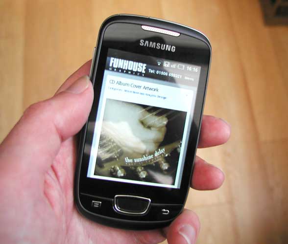
Likewise the image below, showing the compact version of funhousegraphics.com in an Android window, will itself be resized to fit a hand-held screen. So the mobile version of this site has all the video and functionality of the desktop version and serves up the very same creepy content, but with its own compact layout.
But hang on, don’t you need to build an app for people to download in order to dish up a proper mobile-friendly website? No, you don’t. Unless you want your mobile version to do something radically different from the desktop version (not just looking different, but having a different function) you won’t need to think about apps.
Mobile usage has been increasing dramatically and as the phones themselves get more sophisticated, people are expecting more from them. It’s up to web designers to find ways of delivering content to fill this need.
See my earlier post on html5 video, How Do I Make My Web Videos Html5 Compliant?

Categories: Mobile-Friendly Website Design |
Tags: 3d animation, Mobile-Friendly Website Design, SEO, SEO consultant, Search Engine Optimisation, apps, hand-held device | No Comments
September 7th, 2011


I haven’t done any cd sleeve designs for a while, but then I was asked twice in a short space of time to come up with some packaging. Given that the reason I wanted to be a graphic designer was so I could create record sleeve artwork – I’m talking LP’s here, remember them? Big things that folded out with lots of cool graphics and lyrics you could read – I’m always happy to turn my hand to CD sleeve designs, even if I need a magnifying glass to see them.
The two bands here are both Edinburgh-based, but musically they couldn’t be more different. The Sunshine Delay have an alt-country vibe at their heart but they mix it with a rootsy rock and pop to create their own distinctive sound. Easy Tigers are fronted by Craig Ross – who also moonlights with Broken Records – and specialise in rustic, warm soundscapes. Both bands are well worth hearing.


Update:
My friend Neil Sommerville is a percussion tutor and runs the Edinburgh Schools Rock Ensemble (ESRE). You know, for kids? Every year the kids put out their own CD recording and every year I produce the sleeve artwork. Neil tells me this is the 10th year we’ve been doing this. I figured some of these kids must be getting a bit long in the tooth by now, but it turns out there’s a new batch every year. It’s only me that’s getting long in the tooth. With this logic, the secret to eternal youth would be to be a member of ESRE.
As it was their anniversary year, they decided the new CD should be a double compilation of the best tracks from the nine previous discs and Neil suggested a Sgt. Pepper pastiche in order to build a collage of members past and present. That sounded fine but this band has had more members than the Drifters. Soon I was suffering from cut and paste exhaustion and had to have a lie down. Anyway, this is the result. Neil is the one with his back to the camera, bottom centre. He’s very tall.

Categories: Miscellaneous Graphic Design |
Tags: Album Cover Artwork, Edinburgh, cd artwork, cd sleeve design, esre, sgt pepper | 2 Comments


